

Why Colour Matters

Using Colour Psychology in Ecommerce Photography
At D!, we believe content is not just about aesthetics - it’s about strategy.
In ecommerce, visuals work harder than words: they sell, persuade, and differentiate. Among all visual elements, colour is one of the most powerful. It shapes how customers perceive a product, whether they trust a brand, and whether they ultimately convert.
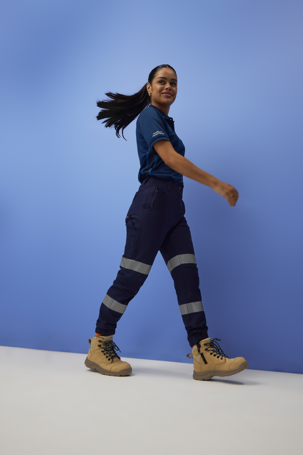
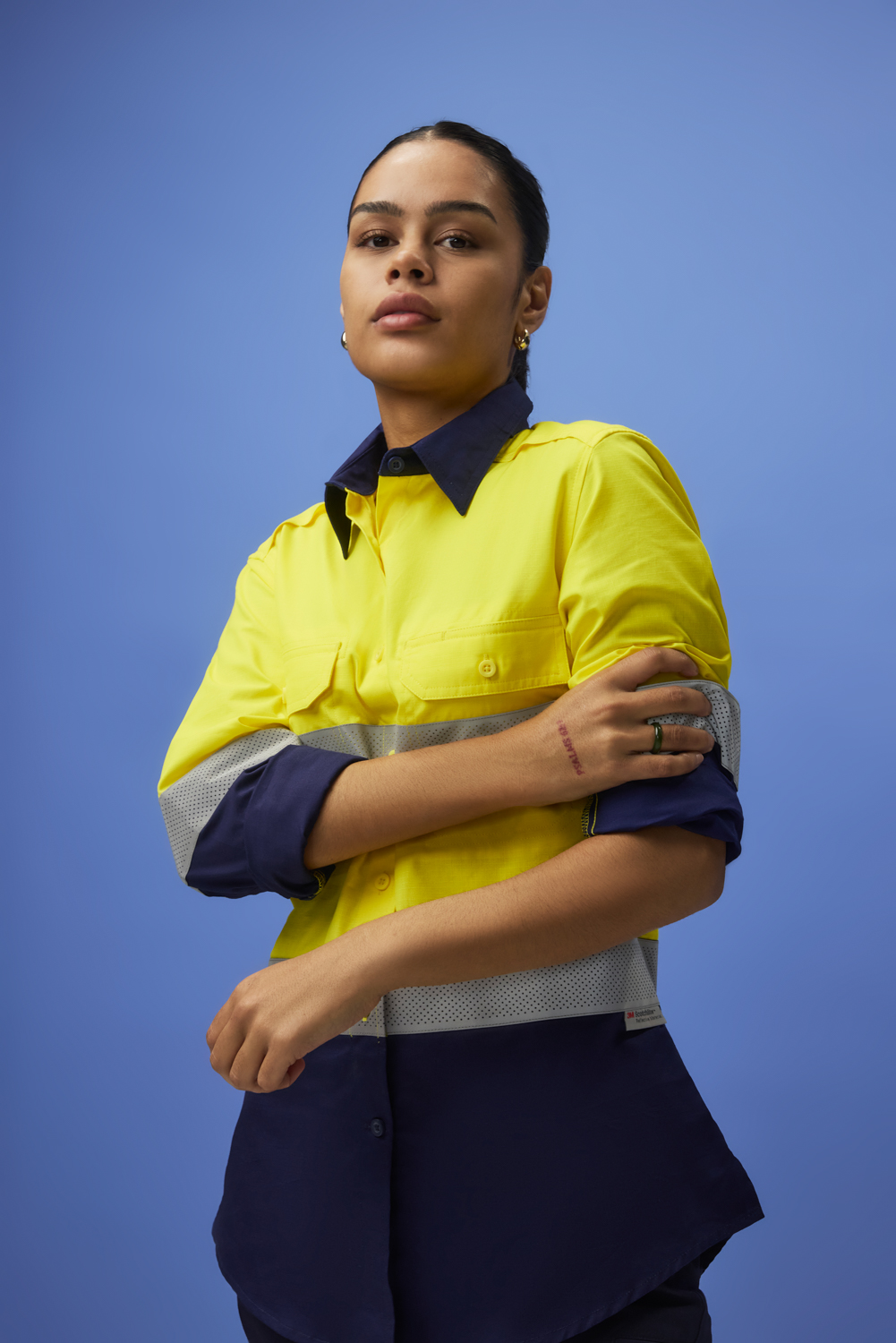
For our recent campaign photography with a women’s construction safety workwear company, we took this principle to heart. The collection was bold, designed for women working across construction sites - and we needed to match that energy.
Instead of neutral backgrounds, we used striking orange and blue backdrops to amplify the garments and align with colour psychology.
The aim wasn’t just to make the images “pop.” It was to create a consistent, conversion-driven content library designed to perform across ecommerce platforms, social channels, and digital advertising.
Why Colour is Critical in Ecommerce Photography

Unlike in retail stores, ecommerce customers can’t feel fabrics or test functionality. Their decisions come down to what they see on a screen.
That’s why ecommerce photography is such a powerful business tool - and why colour plays a starring role.
· Orange is associated with energy, determination, and action. For this shoot, it reinforced the hardworking, high-performance qualities of the garments while creating a sense of confidence.
· Blue communicates trust, safety, and dependability. For protective workwear, this was a direct link to the values customers care about most.
The combination created a dynamic contrast that not only complemented the products but also reinforced the brand’s positioning as bold, modern, and reliable.
Colour isn’t just an artistic choice; it’s a shortcut to trust and recall in ecommerce. Brands that use colour strategically have an advantage before customers even read a product description.
Colour as a Branding Tool

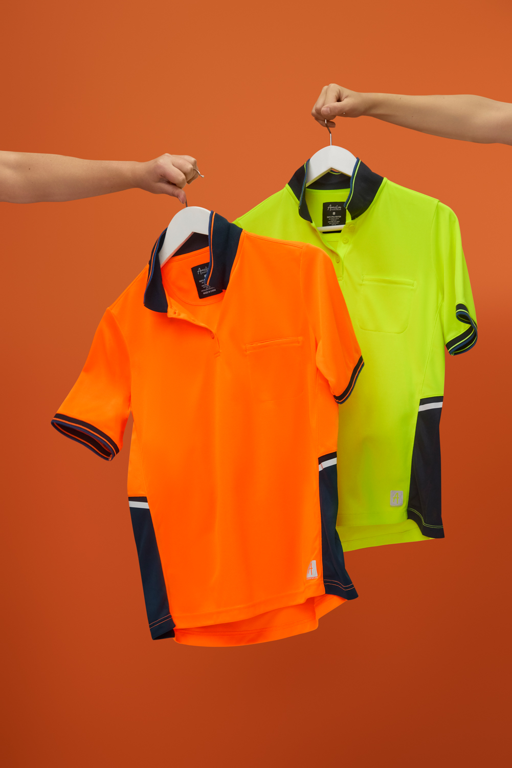
One of the biggest challenges for functional product categories like construction workwear is differentiation. Many brands rely on plain white or grey backgrounds for simplicity. While clean, this approach can flatten identity, making one brand look much like another.
By integrating bold, intentional colour into the campaign, our client achieved three things:
- Recognition. When customers see a consistent colour palette across ecommerce platforms, ads, and campaigns, they start to associate those colours with the brand.
- Differentiation. Vibrant colour ensures product images stand out in crowded ecommerce grids, scroll feeds, and marketplaces.
- Emotional resonance. Colours like orange and blue go beyond visual appeal - they create a subconscious sense of empowerment, reliability, and energy.
- Recognition. When customers see a consistent colour palette across ecommerce platforms, ads, and campaigns, they start to associate those colours with the brand.
This wasn’t about decoration. It was about using colour to tell the brand’s story and communicate values instantly.
For ecommerce brands, colour is brand equity. When applied consistently, it improves recall, elevates positioning, and builds trust at scale.
Why We Shot in Studio

Executing a colour-first strategy requires precision. Shooting in our fully equipped photostudio in Sydney gave us complete control over the creative environment.
· Backdrop precision. Seamless orange and blue backgrounds created cohesion and mirrored the collection’s vibrancy.
· Lighting control. Studio lighting ensured accurate colour reproduction and allowed us to highlight fabrics, textures, and safety details.
· Efficiency. By keeping everything in-studio, we captured a high-volume library of assets in a single day, maximising ROI.
The result was not only striking visuals but also a scalable content library. For ecommerce, where consistency across dozens of SKUs builds trust and professionalism, this level of control is critical.
Studio shoots aren’t about playing it safe - they’re about efficiency, scalability, and delivering ecommerce-ready assets that perform across every channel.
Motion Meets Colour: Videography for Ecommerce
Still photography sets the tone, but video drives engagement. As part of our videography offering, we extended the colour-driven strategy into motion.
We produced short, platform-ready clips that:
· Showed products in action against bold colour backdrops.
· Highlighted garment flexibility, fit, and performance.
· Delivered vertical, social-first cuts for Instagram Reels, TikTok, and paid ads.
Video doesn’t just show what a product looks like; it shows how it works. Paired with strong colour strategy, these clips gave the brand assets that stop the scroll, increase time-on-page, and support higher conversions.
Pairing colour with motion creates ecommerce assets that are dynamic, memorable, and conversion-focused.
What Other Brands Can Learn
This project wasn’t just about one campaign. It demonstrates how colour psychology can be applied across industries to elevate ecommerce marketing.
· Align colours with brand values. Safety brands may lean into blue for trust; premium brands may use black or gold for luxury; eco-brands may use green for sustainability.
· Build consistency across channels. Colour palettes should carry from product pages to ads, emails, and socials, reinforcing brand identity at every touchpoint.
· Think beyond aesthetics. Colour is not decoration - it’s a strategic tool that influences behaviour, recall, and loyalty.
Colour should sit at the intersection of creative and commercial strategy. When used intentionally, it drives both recognition and revenue.
Behind the Scenes: Showing the Process
Alongside the campaign visuals, we also produced a behind-the-scenes video to give our client additional content value. For us, BTS is more than just a “bonus reel” - it’s a powerful storytelling tool.
Why include BTS?
Because transparency builds trust. When brands share behind-the-scenes content, it demonstrates care, intention, and authenticity.
Customers - both B2B and B2C - respond positively when they see the craft behind the polished final product.
For our client, the BTS video became an asset in its own right: perfect for social media, brand storytelling, and showing their customers the level of detail that goes into creating high-quality, reliable workwear.
Why Work With D!
At D!, we’re not just image-makers - we’re strategic partners. We understand how to transform practical products into high-performing brand stories.
Our team of elite content creators delivers seamless production across photography, videography, retouching, and editing. With our fully equipped photostudio in Sydney, we deliver bold campaigns that maximise efficiency and consistency.
Through our expertise in advertising photography and videography in Sydney, we create dynamic, conversion-focused assets optimised for ecommerce, social, and paid campaigns.
Backed by global partnerships with online retail brands, we thrive on producing content that delivers value beyond visuals: growth, sales, and measurable results.
If your brand is ready to harness the power of colour psychology in ecommerce photography, D! can make it happen.


